Membership List | Publications | Research | Profiles | Braided Learning Ejournal
A Sense of Murder: making datalogging interesting
Introduction | In the classroom | The introductory lesson | The Light lesson | The Sound lesson | The Temperature lesson | The final lesson, investigating sampling rates | The Author
Introduction

Interpreting sensor data can be a difficult area for the pupils to understand. How can we make datalogging interesting? Our idea was to solve a murder at the Data Inn. The pupils looked at the data for each of the rooms: light, sound and temperature; they then tried to deduct whether the suspects' alibis matched with the data.
The learning activities were reinforced with practical sessions using the dataloggers, in order for the pupils to make a connection between the real-life data collection and what it means.
The outcomes were the pupils really enjoyed the problem-solving, developed a firm-foundation in interpreting data and the quality of the conversations and use of language surprised everyone. Whodunnit? - You’ll have to find out!
In the classroom
Each lesson was based around the three-part model of starter, main and plenary sessions, with clear objectives outlining the learning points. A major feature was the pupils’ discussions and explanations of their ideas and so there were many assessment for learning opportunities. As each lesson was linked to practical activities and demonstrations of datalogging, the pupils fully engaged in carrying out the experiments and were able to explain what was happening.
The introductory lesson
We started the topic looking at the opening scenes of the software, ‘A Sense of Murder’ (available from Commotion, www.commotiongroup.co.uk 01732 773399). This introduced the background brief to the murder of Lux Lumens, the Industrial Tycoon. Also, the pupils met the four suspects, Hugh Middity, Val Ume, Anna Logg and Darren Heit. This opened a dialogue between the pupils about ‘How and where do you think the murder took place? Can people look guilty just by their appearance? Who do you think had the greatest motive?’
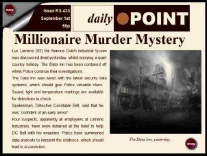
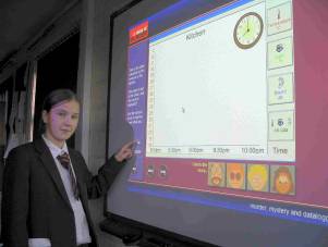
The first lesson held the key to creating the excitement and interest in the topic. The class looked at the newspaper article explaining the murder case; they had been chosen as the detectives to solve the murder.
 |
 |
| There’s been a murder | Considering the suspects’ alibis |
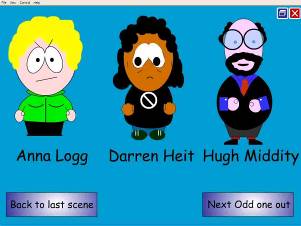
Now that the children were hooked, an ‘Odd-one-out’ activity was used to warm their brains up. The activity started simply with three suspects from the murder.
Teacher: “Who is the odd-one-out?” (Choices: Anna, Darren and Hugh)
Pupils: “Anna, because she’s the only girl.” “Hugh, because he’s wearing glasses.” “Darren, because he looks worried.” “Anna, because she looks angry.”
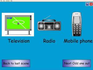
The next odd-one-out pages developed the pupils’ ideas and the teacher ensured that as the activity developed, that all of the class were involved. The choices changed from people to objects.
Teacher: “Which is the odd-one-out?” (Choices: Television, radio and mobile phone)
Pupil 1: “Radio, because it doesn’t have a screen.”
Pupil 2: “Mobile phone, because you can talk to it.”
Pupil 3: “Radio, because it’s not interactive.”
Teacher: “What do you mean by interactive?”
Pupil 4: “You can press the red button on the TV and get more information and you can press buttons on the phone and get more information, the radio just makes sounds.”
Pupil 5: “You can change stations to get more information.”
Pupil 6: “But that’s just lucky if you get what you want, on the TV you can get to play games and on the phone.”
 |
 |
| Who is the odd-one-out? | Which is the odd-one-out? |
The final choices were ‘Light’, ‘Sound’ and ‘Temperature’. This proved to be much harder for the class as the choices were not objects i.e. if the options were a light bulb, radio and fan heater, they would be able to find the odd-one-out more easily. After discussion with each other in pairs, the pupils returned their ideas.
Pupil 1: “We think sound is the odd-one-out, because a light bulb gives out light and gets hot.”
Pupil 2: “You can get sound from lights, these strip lights in the classroom make a buzzing noise, so sound isn’t the odd-one-out.”
Pupil 3: “The Sun gives out light and heat, but doesn’t make any sound.”
Pupil 4: “It might do, but we’re too far away to hear it.”
The lesson moved on to a new activity of describing pictures and graphs. The aim was for the pupils to realise the importance of using precise language to explain and communicate their ideas.
 |
 |
| Describing the pictures | Pupils’ drawings |
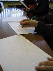
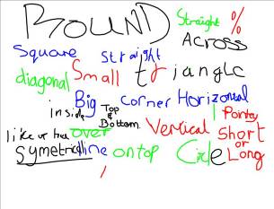
The pupils worked in pairs, sitting back-to-back. One pupil described the six pictures and the other attempted to draw them. They were allowed five minutes, but they were not allowed to look at each other’s pictures until the time was up. Then they compared the pictures and discussed the words they had used to instruct and question during the drawing. The pupils then wrote these words on the interactive whiteboard. A rich variety of words were collected, ‘straight, percentage, diagonal’ and they also used angles, points on the compass and the hours on the clock to describe the directions to draw the lines.
 |
 |
| Key vocabulary used by the pupils | Who has an idea? |
The class all thought that they had drawn the pictures accurately. After praising them, it was pointed out to them that even though they had captured the shapes well, they needed to evaluate the positioning on the page and the scale of the drawings. After the pupils gave themselves brief self-evaluations, they swapped over and it was the instructor’s turn to draw and vice versa. This time the pupils were much more precise in their language to guide each other and in the positioning and scale of the drawings.
The final part of the lesson attempted to link the pupils’ precise language to describe graphs of data; this was to aid their work in interpreting the datalogging information.
Each pupil was given a different sheet which had a graph on the top half and a blank set of axes on the lower half. The pupils had to find a person with the corresponding graph, so that they could draw the trace on their lower graph. For example, the top graph could contain light data and the lower blank graph could be labelled in decibels. Therefore, this pupil would need to find another one who had the sound graph data. This pupil could then find another pupil who needed to draw the light data on their graph. The class really enjoyed the activity, finding the appropriate match and then going through the challenge of describing the journey of the data.
The lesson concluded by reviewing the main teaching points and highlighting the richness of the language the class had used. The software was revisited to read the murder newspaper article and to think of questions they would like to ask the suspects.
The Light lesson
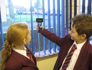
The next lesson focussed on the light sensor and where light sensors might be used, for example, night lights in a baby’s room or security lights, which switch on overnight. The starter activity began by looking at real data. The datalogger was connected to the projector and the pupils watched the data trace appear. The graph line jumped around the screen as the datalogger was pointed at the classroom lights, at the daylight coming through the window, at the shade under a desk and when covered with a hand. Then all the lights were switched off and the blinds closed. The pupils were involved in predicting where they thought the trace would move to as each light was switched on and as each blind was opened. They observed what they called ‘a step up’ each time more light was detected by the datalogger. The class then looked at the overnight data and they attempted to explain what had happened.
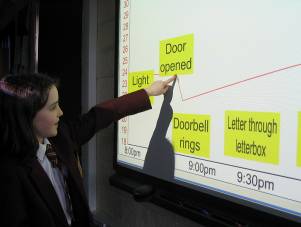
The next activity was a ‘Living graph’ of the data for the Hall, which followed the same format of the data in the ‘A Sense of Murder’ software. The pupils decided which data they would look at, light, sound or temperature; they chose to look at light first. They read the annotation labels which they need to arrange on the graph, for example, ‘Door opened’, ‘Light on’, ‘Doorbell rings’, ‘Letter through letterbox’, ‘Dog barks’. The pupils were allowed thinking time and they discussed with each other their initial ideas. The first pupil came and dragged a label into position on the graph and explained why they had placed it there.
Pupil 1: “I put the ‘Light on’ there on the graph, because you can see it goes up like a step, just like before when you switched on the light in the classroom.”
The next pupil came and placed the next label on.
Pupil 2: “I put ‘Doorbell rings’ there, because the bell rings first and then they switched the light on and opened the door.”
Teacher: “You story makes sense, but can we tell from the graph? Remember, which data are we looking at?”
Pupil 2: “Light”
Teacher: “So, is there any evidence on this light graph which tells us that the doorbell rang?”
Pupil 2; “Not on this graph, we could look at the sound graph.”
The activity developed allowing the pupils to place the labels on the different graphs. When this was carried out with a Year 8 class, they were better at focusing on the data than the Year 5 classes. The younger pupils inferred more by the statements than the data, i.e. they sequenced them into a story without looking at the data. So, the activity was turned around. One pupil placed the labels randomly on the graph and the class decided if they could give reasons, based on the information in the graph. They came to the conclusion that if you have the three graphs you can place the labels with supporting evidence, but just looking at one graph means you sometimes need to make up a story.
 |
 |
| Monitoring light levels | Using a living graph |
The pupils took turns to use the dataloggers to look at the light levels around the school and the TV resource, which was part of the software. The pupils pointed the datalogger at the middle of the TV animation on the computer screen and changed the channels on the TV. Once the data was downloaded on to the computer, into the LogIT software, the pupils explained the graph and added annotation labels. This reinforced their learning and provided an assessment for the teacher, showing they had understood the activity.
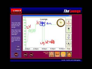
The ‘A Sense of Murder’ software was started and the teacher discussed what they understood by an alibi. On the computers, the pupils were allowed time to listen to the alibis and look at the light data for the rooms. Finally, for the plenary, the class annotated the light data for the Lounge graph.
 |
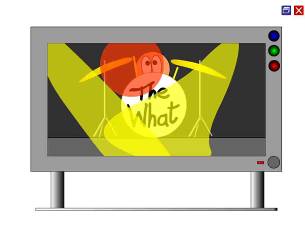 |
| Annotating the data graph | The animated TV |
Teacher: “Hugh said he was watching the TV, do you think he is lying?”
Pupil 1: “I think he’s telling the truth.”
Teacher: “Why? Is there a part on the graph which matches his alibi?”
Pupil 1: “He says he was watching TV and the light graph jumps up and down like the TV was flickering.”
Teacher: “Put your hands up if you agree…hands down. OK, hands up if you have a different idea.”
Pupil 2: “I think it was when someone switched on a florescent light, because they flicker on and off, before going on properly.”
The Sound lesson
The datalogger was recording as the pupils entered the room. The pupils started to notice the trace on the interactive whiteboard reacting vigorously as they settled down into their seats. The trace disappeared below fifty decibels and as the teacher spoke the trace jumped up on the screen; then it was the pupils’ turn. Conducted by the teacher, the class practiced whispering, murmuring, becoming slightly louder into chattering and then a short shout. The graph on the screen reflected the changes in the sound levels, so the pupils came out to annotate the graph with the appropriate words. An emphasis was placed on using accurate language.
Teacher: “Can you tell me the story of the sound graph?”
Pupil 1: “It is silent then sound gets higher.”
Teacher: “What are the units on the sound graph?”
Pupil 2: “Decibels”
Teacher: “Does that measure how loud or soft a sound is or does it measure how high or low-pitched a sound is?” “Hands up for louder and soft…now, hands up for high and low.”
In order to check the pupils did not hold a misconception about the loudness of a sound and its pitch, the class were instructed to make a high-pitched sound and then a low-pitched sound at around 90 decibels. Then they made high and low-pitched sounds at around 60 decibels.
Teacher: “When the line on the graph goes down from 90 to 60 decibels, is the pitch of the sound changing?
Pupil 3: “We can’t tell, because the graph just tells us how loud the sounds are.”
The class thought of places where you might need a sound sensor. They suggested a monitoring system for a classroom to judge when a class is being too noisy.
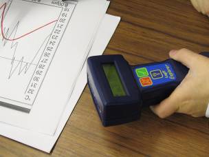
The pupils started the ‘A Sense of Murder’ software and continued to solve the crime. The pupils with the datalogger used the ‘Radio’ part of the software. By holding the sensor next to the computer’s speakers, the pupils recorded the sound levels for the different radio stations on the virtual radio. They then annotated the graph to identify when the radio station was playing Rock music (loud), Dance music (repetitive beat) or a comedy programme (from quiet to loud when the audience laughs).
 |
 |
| Monitoring sound levels | The animated radio |
The activities were closely related to the alibis of the suspects. Therefore, the pupils were able to match the patterns from the sound graphs of the datalogger to the graphs in the different rooms in the software.
The Temperature lesson
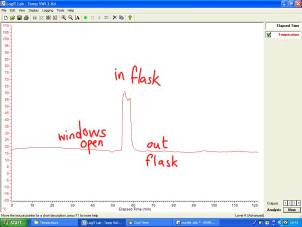
The lesson began with the class looking at the temperature trace from the datalogger which had been collecting overnight. The pupils described the story of the graph as the temperature dropped and rose again when the school heating was switched on. They were then asked to predict what would happen if the temperature sensor was placed into a flask of hot water, which was boiled an hour before.
Pupil 1: “The line on the graph would go up.”
Teacher: “What would happen if I didn’t place the sensor in the water, but placed it above the water?”
Pupil 2: “It would go up, but not as much as if you’d put it in the water.”
Teacher: “OK, then, come and draw on the whiteboard the line you think the temperature trace will follow.”
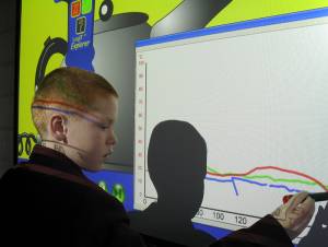
The pupils drew their lines and the datalogger was placed above the hot water. The class watched and evaluated whether their predictions were correct. Then they predicted the graph shape for placing the sensor in front of a fan heater and out of the window.
 |
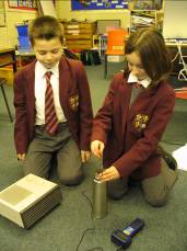 |
| Annotating the temperature graph | Measuring the temperature |
The next activity involved the pupils using the virtual kettle (part of the software). The animated kettle boiled onscreen and the simulated temperature data was plotted on the graph. The animation was paused and the pupils were again asked to discuss and predict the shape of the graph as the kettle reached boiling point.
 |
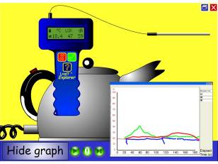 |
| Where do you think the graph will go? | The virtual kettle |
The class continued to solve the murder case, matching the temperature data to the suspects’ alibis.
Teacher: “When the character says ‘it’s freezing’ is there any evidence in the graph?”
Pupil 1: “It’s freezing…it’s a turn of phrase, it’s not really that cold”
Teacher: “What temperature do you think the room would be if it was freezing?”
Pupil 2: “Zero Celsius”
The final lesson, investigating sampling rates
The pupils now were at the stage of having a solution to the crime. They had analysed to data and matched it to the suspects’ alibis. So before the conclusion of the topic, the concept of sampling rates was considered.
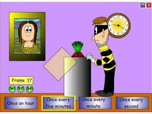
From the software, ‘The Jewel Thief’ activity was projected onto the whiteboard. The scenario was a museum containing a special jewel, which was watched over by security cameras. The cameras could only store a limited number of frames, so the pupils discussed between themselves about how often they wanted to take a picture. If they captured too often, they could run out of pictures, if the intervals were too large, they could miss the thief entering. The quality of their ideas and explanations were excellent, it clearly showed the development of their questioning and collaborative skills over the lessons.
 |
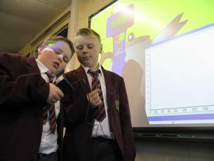 |
| The Jewel Thief | Watching the detectives |
The class then considered monitoring different scenarios and decided upon which sensors would be most appropriate and suitable sampling rates. This enabled them to construct experiments for each other, which they would investigate in future lessons.
Finally, the whole class deliberated on the alibis and the data to solve the crime. Again, the precise language they used and the interpretation skills they displayed showed that they had developed their abilities over the lessons and most notably enjoyed themselves. Eventually, they discovered that the murderer was…arrrggh! Thud!
Author details
Steve Bunce is an ICT Consultant in Northumberland and is passionate about ICT and pedagogy. He will happily answer any questions regarding the article (email ).
[Back]
